The Coop
BRANDING, LOGO, PACKAGING
ROOSTER TEETH
2018
ROOSTER TEETH
2018
Founded in 2018, The Coop is a pop-up shop companion to Rooster Teeth’s annual convention “RTX” in Austin, Texas. It is a limited-time brick-and-mortar location offering original merchandise and artwork made exclusively for The Coop from designers such as Aaron Draplin, Todd Francis, Hydro74, Meow Wolf, and more. I was given the task of branding The Coop for its premiere at RTX 2018. Read coverage from tubefilter.com about The Coop (2018) here and check out The Coop’s micro-site here.
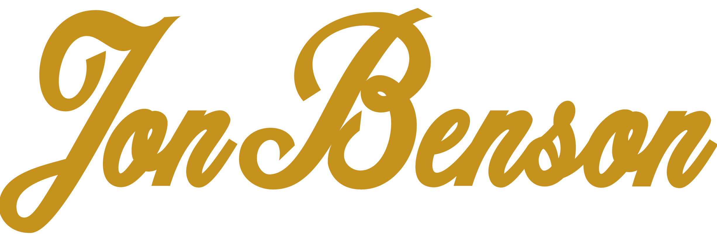
Logo Design
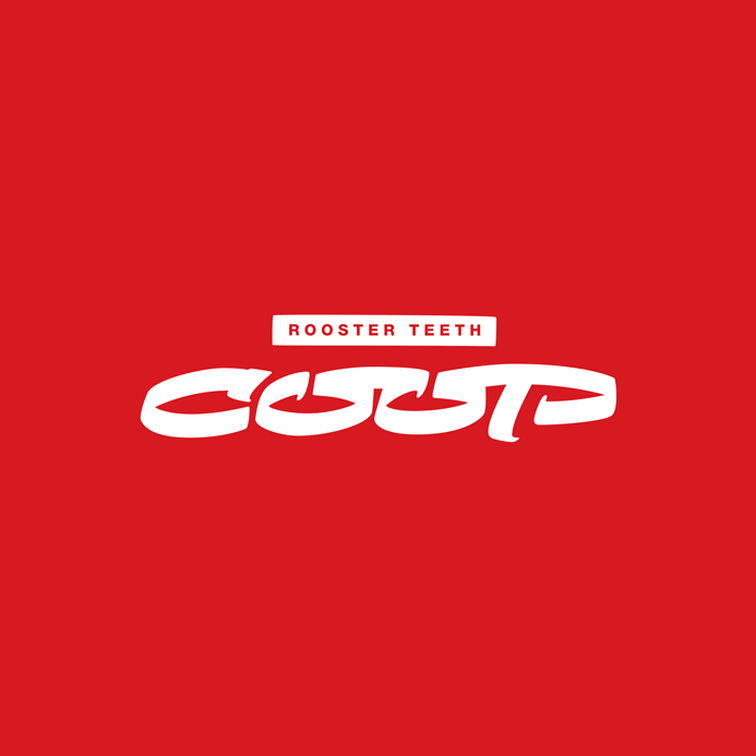
The logo’s design was made with the intent to communicate “less fandom and more fashion”, as Geoff Ramsey (one of Rooster Teeth's founders) described The Coop in an interview with Tubefilter. The Coop’s inventory boasted more premium quality items than the standard Rooster Teeth Store so the logo needed to convey boldness, class, and exclusivity. A “coop” is another word for a hen house, or simply a shelter for ground birds. Given the word inherently means a kind of structure, and The Coop is only accessible as a brick-and-mortar location (no online sales were offered), the square shape containing the brush script communicates a physical presence and exclusivity in a minimal style. In contrast with the rigid geometry of its container, the type treatment is an organic brush, conveying excitement and energy with its italicized slant and thick brush strokes.
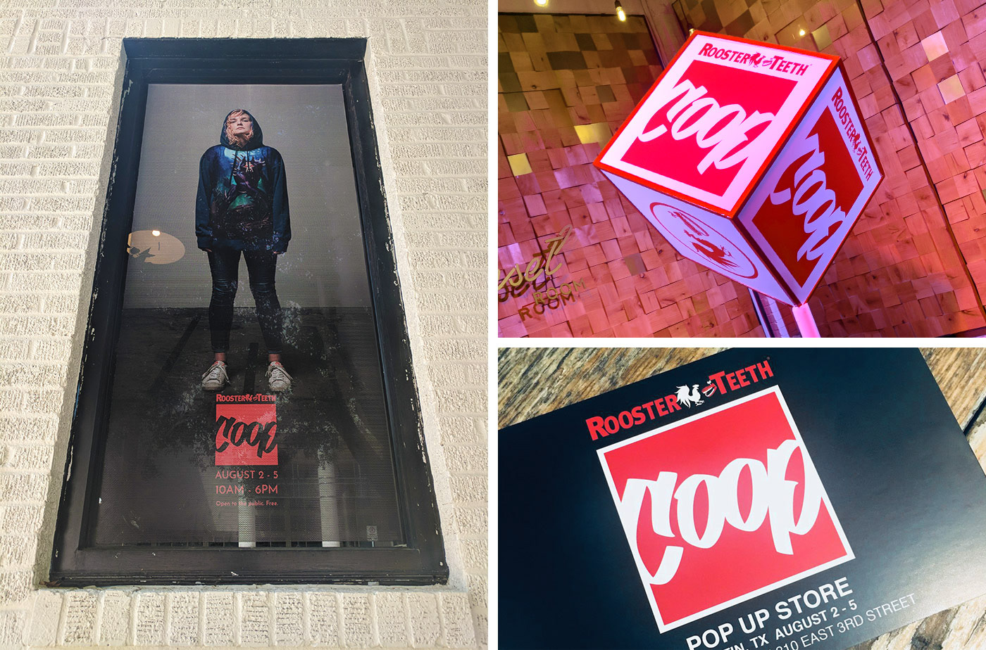
THE COOP (2018) | Left to right clockwise: window graphic, in-store interior decor, postcard promotion (image credit: @TheRTStore on Twitter)
Packaging Design
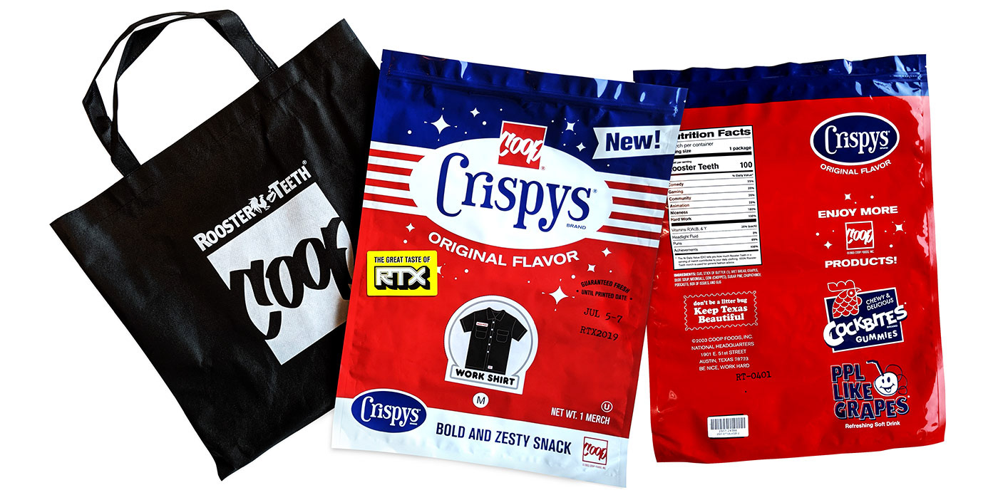
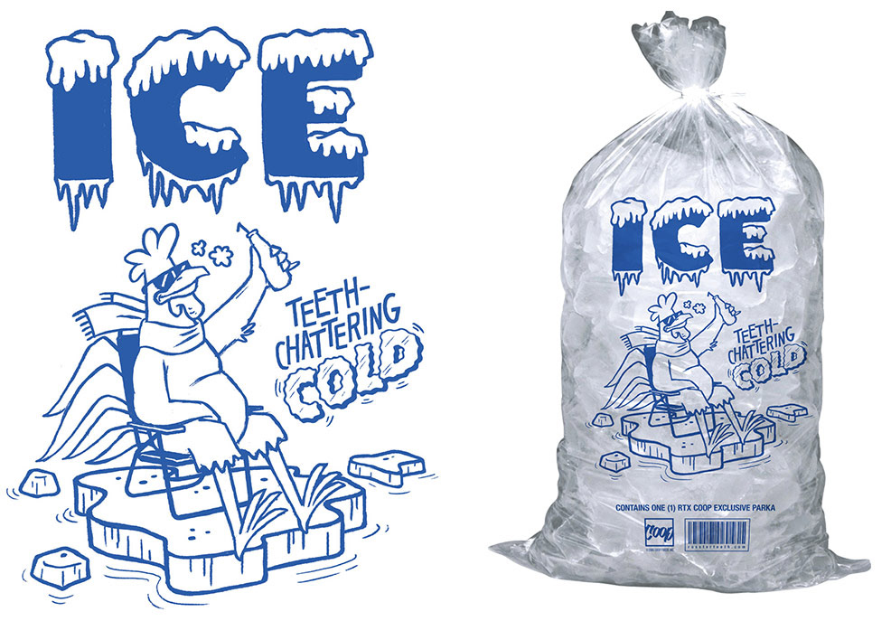
2019 reintroduced The Coop as “Coop Video”. The entire shopping experience was turned into a VHS rental store where all tees were packaged into VHS boxes, hoodies into giant snack bags, and a parka was even sold from a freezer in ice bags. I was responsible for designing the snack and ice bags. For the snack bag I referenced vintage potato chip snack packaging and from that aesthetic Coop Crispys was born! I had so much fun creating everything from the inside joke-filled nutritional info to the promotional graphics for other fine Coop snacks such as “Cockbite Gummies” and "Ppl Like Grapes” soda. For the parka ice bag I parodied the classic ice bag illustration of a penguin with sunglasses sitting in a lawn chair on a floating chunk of ice, raising a drink to the sun--I simply swapped in a cool scarfed rooster.
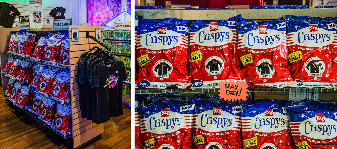
COOP VIDEO (2019) | Images credit to juxtapoz.com from their feature article about Coop Video.
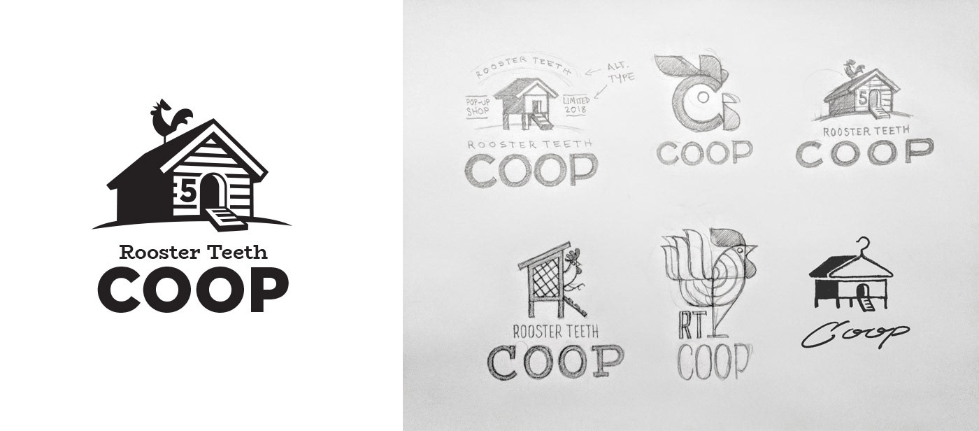
Logo Concepts
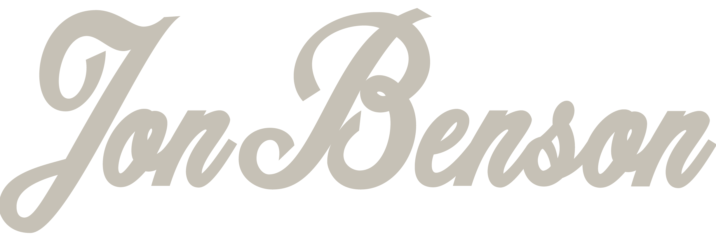
Several logo options were explored, beginning with more literal depictions of chicken coops and roosters. As the project moved forward the logo was focused and refined to just a wordmark. The example above shows an early version of the brush script used in the final form.